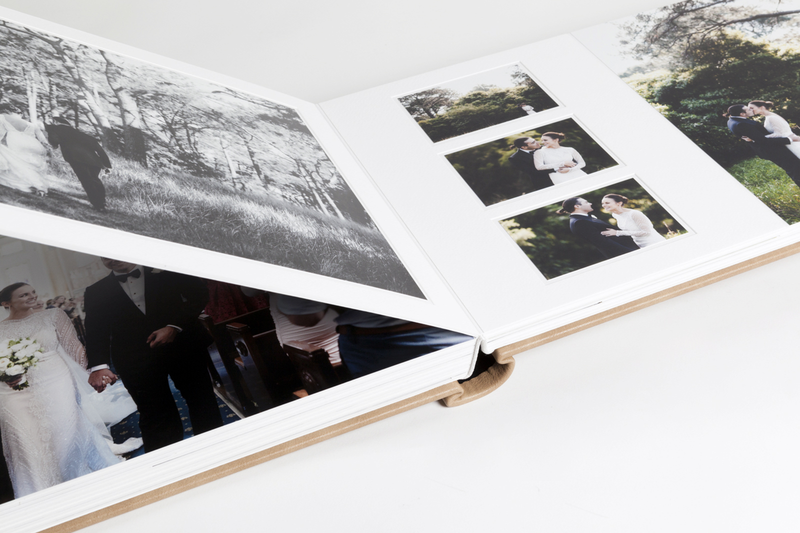
How many Images should I include in my album?
We get this question on a day-to-day basis and it’s always tricky to answer. How big is the album? What’s your style? Do you like big images or lots of white space? Do you have a story to tell?
But we understand why photographers ask the question, and why their clients may need guidance too.
Submitting 300 images for an 8x8 album just won’t work. Sometimes you’ll have thousands of shots from an event and your first challenge will be selecting the hundred or so to go in the album!
The maximum number of images you'll be able to upload for albums 12x12 and larger is eight per layout (two sides). For smaller albums the limit is six.
But those are maximums, and in a small album could result in some very small images!
Here’s the guide our own designers use when creating album layouts. If you love white space, or you believe that “less is more”, or that big images rule, you may prefer even less images.

For weddings: You need plenty of room to tell the story of the day, so weddings generally require a bigger album and more pages. These guidelines assume a 12x12 or larger album, and a maximum of 6 images per layout (spread) on average. In a 10x10 album allow up to 4 images per layout, or some images may be so small they lose impact.
10 page album (20 sides) = 40-60 images
15 page album (30 sides) = 60-90 images
20 page album (40 sides) = 80-120 images
25 page album (50 sides) = 100-150 images
30 page album (60 sides) = 120-180 images

For portraits, families, boudoir etc: These albums are generally less about storytelling and more about picking favourites from the shoot. The size of the album is more a personal preference too. Regardless of the album size, we recommend no more than 2-3 images per layout (on average) to give the images space to breathe.
10 page album (20 sides) = 20-30 images
15 page album (30 sides) = 30-45 images
20 page album (40 sides) = 40-60 images
25 page album (50 sides) = 50-75 images
30 page album (60 sides) = 60-90 images
Choosing the right images
Weddings: Don’t just accept your clients’ favourites! If you let your clients choose, make sure they pick a good selection from the day. If there are no photos of the wedding vows or the groom’s parents, sooner or later someone will be unhappy. It’s important to include scene-setting shots too — the venue, the guests, the table settings, the flowers, the dance floor etc. If you’re designing the albums yourself you can “fill in the gaps” as you work, but if Queensberry is designing you’ll need to do that before you place the order!
Portraits: This is about even-handedness and variety. Be sure to include an even selection of each person in the family or group, and to avoid too many shots that are variations on the same theme. That, plus a variety of sub-groups (eg Mum and Dad, the kids together), and different poses, activities, and backdrops are the key to designing an album that's engaging, and flows … and encourages people to add more pages!
Featured imagery: Cinemotive (AUS), Uber (AUS).
Alexandria
Comments